10,000 search results
(0.19 seconds)
- The Night Lamp by Putracetol,
$28.00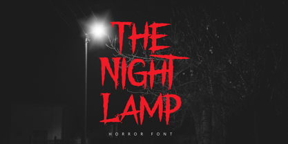 The Night Lamp is a horror style display font. Inspired from horror thriller movie. This font designed for Halloween, Horror, Thriller and Scary theme projects. The Night Lamp would be perfect for logo, quotes, apparel, comic, cover books, cards, posters, or anything that requires a horror or scarylook!
 - Mechanoid by Studio K,
$45.00 Mechanoid is a machine age font: crisp, clean, bold and unadorned, yet with a distinctive character of its own. As the name suggests it is well suited to engineering or technological themes, yet versatile enough for universal applications.
 - Soda Fountain JNL by Jeff Levine,
$29.00 In most cities during the 1950s and 1960s the corner pharmacy or soda shop was a mainstay of teenage life. It was a place to hang out with friends, hear the latest hits on the jukebox and indulge in everything sugary from malted milkshakes to banana splits. During this time, a popular form of window advertising was supplied by the Coca-Cola Company to promote its product being served by these locations. Specialty window decals designed to emulate drawn (raised) Venetian blinds "bookmarked" by the soda's logo were adhered to the shop's windows, with a space provided to add in customized lettering. The store's name or its specialties were applied to each window pane, and this formed a consistent border at the top of all of the shop's windows. Although few visual images exist of this specific bit of advertising nostalgia, an old record album by a late-1950s singer named Chip Fisher called "Chipper at the Sugar Bowl" provided a somewhat usable sample for what is now Soda Fountain JNL.
 - Chimphand by One Fonty Day,
$6.00 Chimphand is an organic, natural and contemporary handwritten typeface with their tall x-height. Weights of light, regular and bold for both normal width and condensed allow you to play with the typeface more. In addition, you will have an access to their style sets ( Gap ) to add stencil-ish character to every weights. This gap style is much more subtle than normal stencils, but unique and nicely fit to the typeface. Gaps are more visible on larger fonts and bolder weights. Chimphand is good for any purpose, but works more on shorter text. Thanks and enjoy!
 - Neuborn by HIRO.std,
$10.00 Introducing Neuborn Font Family Neuborn is a Sans Serif Font Family (Light, Light Italic, Regular, Regular Italic, Regular Hollow, Regular Italic Hollow, Medium, Medium Italic, Medium Hollow, Medium Italic Hollow, Bold, Bold Italic, Bold Hollow, Bold Italic Hollow). This Font Template contains Modern, Formal or Non Formal, Classy, Elegant, Strong, Readable, Stylish, Cool, Bold, Minimalist and easy to use. FEATURES - Uppercase and Lowercase letters - Numbering and Punctuations - Multilingual Support - Works on PC or Mac - Simple Installation USE Neuborn works great in any branding, name card, logos, apparel, produk pagaking, flyers, magazines, label, films, stationary, posters, etc. and any design project that requires a formal or informal touch.
 - Glance Sans by Identity Letters,
$29.00 Geometric, stylish, and not quite a stencil face: Glance Sans is the urban alter ego of Glance Slab—a strong-willed sans-serif with no frills but a few unique character traits. Glance Sans follows the design principle of nonjoining parts that made Glance Slab successful. Some strokes may not connect to their stems, creating visible gaps and thus, a dynamic impression of balance and movement. However, Glance Sans has a calmer appearance due to the lack of detached serifs. If Glance Slab’s home territory are large, crowded stadiums and massive sports events, Glance Sans prefers streetball courts, well-used skate parks, and underground clubs. It also adapts to urban work environments from finance to high-tech. Whenever a more toned-down look is called for while retaining the elegance of an athlete, Glance Sans is ready to roll. In the city environment, versatility is key. That’s why Glance Sans sports 7 weights as well as a complete set of italics. These are not just sloped romans but individually drawn letterforms, subtly referencing classic italic construction for more effective emphasis. Among the 600+ glyphs of Glance Sans, you’ll find goodies such as six sets of figures, circled numbers, circled arrows, and all kinds of currency symbols in two stylistic versions. Glance Sans is a great tool for industrial and high-tech branding, for wayfinding systems in contemporary or modernist architecture, for corporate identities in arts, crafts, medicine, culture, and education, and for all kinds of sports-themed design. Both members of the Glance superfamily are easily and effectively combinable; both are able to stand on their own feet. With its powerful italics, you might opt for Glance Sans as your text typeface and use Glance Slab for headlines. Or you set large, clean, display-sized lines in Glance Sans and spice them up with a bit of sportive Glance Slab. It’s up to you to decide how to bring out the best in both of them.
 - Rusilla serif by Dealita Studio,
$9.00 Rusilla Serif is a sophisticated serif typeface. Ideally to be applied to other formal forms such as invitations, labels, logos, magazines, books, greeting/wedding cards, packaging, fashion, makeup, stationery, novels, labels, or any advertising purpose.
 - Rockwell by Monotype,
$40.99 Whether you call them slab serif, square serif, or Egyptian, you know them when you see them – sturdy, nearly monoweight designs with blunt, straight-edged serifs and a no-nonsense attitude. The Rockwell® Nova family is a fine example of this appealing and eminently usable type style. This is a design that is both robust and adaptable. Marked by the flat top-serifs on the cap A, unusual Q tail and high-legibility two-storied lowercase a, Rockwell has a bit of handmade charm that distinguishes it from the cool, more modern interpretations of the slab serif style. The family is excellent for branding, headlines and other display uses. The simple shapes and hearty serifs also make it a good choice for short blocks of textual content in both print and on-screen environments. The light and bold weights are perfect for setting blocks of text copy, while the extra bold and condensed designs bring authority to display copy. Throw in a little color, and you amp up Rockwell’s messaging power. The regular and italic designs perform handsomely, in the most modest of screen resolutions. With four weights of normal proportions, each with a complementary italic, and three condensed designs, two with italics, the family is a commanding and versatile graphic communicator. Rockwell’s large x-height, simple character shapes and open counters, make for an exceptionally legible design. It should not, however, be set so tight that its serifs touch, as this will erode legibility and impair readability. A benefit to Rockwell’s slab serifs, however, is that the design combines beautifully with both sans serif typefaces and a variety of serif designs. Rockwell OpenType® Pro fonts have an extended character set supporting Greek, Cyrillic, most Central European and many Eastern European languages, in addition to providing for the automatic insertion of ligatures and fractions. Looking for its perfect pairing? Look no further than ITC Berkeley Old Style, Between™, ITC Franklin Gothic®, Harmonia Sans™, Metro® Nova or Frutiger® Serif.
 - SF Mettle by Sultan Fonts,
$19.99 Mettle Bilingual Arabic font, Latin-Arabic for print and web. The Mettle font family contains four weights: thin, normal, medium, and broad. This font supports Arabic, Latin, Persian, Urdu, and Kurdish languages. The digital designer can use the variable Mettle font to access wider options in working with the text.
 - Core Sans N by S-Core,
$15.00 The Core Sans N Family is a part of the Core Sans Series (Core Sans N SC, Core Sans N Rounded, Core Sans M, and Core Sans G). Letters in the Core Sans N Family are designed with genuine neo-grotesque and neutral shapes without any decorative distractions. The spaces between individual letter forms are precisely adjusted to create the perfect typesetting. The Core Sans N Family consists of 3 widths (Condensed, Normal, Extended), 9 weights (Thin, ExtraLight, Light, Regular, Medium, Bold, ExtraBold, Heavy, Black), and Italics for each format. It also supports WGL4, which provides a wide range of character sets (CE, Greek, Cyrillic and Eastern European characters). Each font includes support for Tabular numbers, Arrows, Box drawings, Geometric shapes, Block elements, Mathematical operators, Miscellaneous symbols and Opentype Features such as Proportional Figures, Numerators, Denominators, Superscript, Scientific Inferiors, Subscript, Fractions and Standard Ligatures. The Core Sans N Family provides both OpenType (.OTF) and TrueType (.TTF) versions in the same package. We highly recommend it for use in books, web pages, screen displays, and so on.
 - Core Slab M by S-Core,
$25.00 Core Slab M is the serif companion to Core Sans M (Text family of the month. May, 2013). This font family has open and square letter shapes, and overall rounded finishes and serifs provide a soft and friendly appearance but also it is strong in headline. Simple and modern shapes with a tall x-height make the text legible and the spaces between individual letter forms are precisely adjusted to create the perfect typesetting. Core Slab M Family consists of 2 widths (Condensed, Normal), 7 weights ExtraLight, Light, Regular, Medium, Bold, ExtraBold, Heavy), and Italics for each format. Combination fonts such as Core Slab M Ice, Berg and Iceberg are also available. Each font includes support for Superiors and Inferiors, Fractions, Tabular numbers, Arrows, Box drawings, Geometric shapes, Block elements, Mathematical operators, Miscellaneous symbols and Opentype Features such as Proportional Figures, Tabular Figures, Numerators, Denominators, Superscript, Scientific Inferiors, Subscript, Fractions and Standard Ligatures. We highly recommend it for use in books, web pages, screen displays, and so on.
 - Street Ruins by Prioritype,
$16.00 Street Ruins A bold display font where you can give off a retro feel and a playful display style. Great for vintage theme designs, book covers, food packaging, merchandise etc. Features: Uppercase, Lowercase, Numeral, Punctuation & Multilingual. Multilingual contained: Afrikaans, Albanian, Asu, Basque, Bemba, Bena, Breton, Catalan, Chiga, Cornish, Danish, Dutch, English, Estonian, Filipino, Finnish, French, Friulian, Galician, German, Gusii, Indonesian, Irish, Italian, Kabuverdianu, Kalenjin, Kinyarwanda, Luo, Luxembourgish, Luyia, Machame, Makhuwa-Meetto, Makonde, Malagasy, Manx, Morisyen, North Ndebele, Norwegian Bokmål, Norwegian Nynorsk, Nyankole, Oromo, Portuguese, Quechua, Romansh, Rombo, Rundi, Rwa, Samburu, Sango, Sangu, Scottish Gaelic, Sena, Shambala, Shona, Soga, Somali, Spanish, Swahili, Swedish, Swiss German, Taita, Teso, Uzbek (Latin), Volapük, Vunjo, Zulu. Thanks :)
 - Morguns by Ronny Studio,
$19.00 Morguns is a bold type of font that has a different character from other bold fonts, Morguns has a strong but soft character, with an elegant and fresh theme, supported by 4 choices of font types, Morguns is able to answer your current needs who are designing something great . Its weight excels in logos, posters, social media, magazine titles, clothing, large print formats - and anywhere you want to see it. Inspired by the design styles that are currently popular, let's make your imagination come true with Morguns. Features : Lowercase & Uppercase numbers and punctuation multilingual ligatures alternates PUA encoded Please contact us if you have any questions. Enjoy Crafting and thanks for supporting us! :) Thank you
 - Marlowe by FaceType,
$30.00 If you are looking for a unique typeface with a light and pure elegance, Marlowe will be your choice. Marlowe is the rat pack of fonts: Regular is perfect for headlines and subtitles, while the expressive Escapade, Swirl and Cocktail styles are charming display fonts. All four provide an extended set of capitals, small caps and lower case characters. Please take a close look at the elegant alternate letters for A, E, K, M, N, O, Q, R, W and g – there are even three kinds of ampersands to choose from. Altogether Marlowe offers amazing 25 alternates and 74 discretionary ligatures, while Marlowe Swirl has additional 26 automated ligatures. Make sure you use applications supporting all these lavish OpenType features.
 - Benjoet by Forberas Club,
$16.00 Benjoet is a fun and whimsical paint brushed display font. This font is perfect for children themed designs, especially when combined with bright colors.
 - Corn by 4RM Font,
$9.00 Corn font is handwritten with a casual impression, this font has two styles, namely regular and bold, suitable for use in casual themed designs.
 - Witches Crow by Forberas Club,
$16.00 Witches Crow is a Halloween Treat by our team. It's perfectly matches for any invitation type, and children theme, cartoon, poster, display, and comics.
 - Mallaire by Rochart,
$20.00 Mallaire is a calligraphy font with an exclusive style and a touch of classic, inspired by the handwriting of ancient manuscripts. Carefully designed to work together in harmony that makes it very suitable for wedding media, book covers, greeting cards, logos, branding, business cards and certificates, even for any design work that requires a classic, formal or luxurious.
 - Motiraw by Typesketchbook,
$55.00 Motiraw is contemporary sans-serif typeface made up of 28 fonts across 7 weights with normal and alternate options. It’s a unique and modern sans typeface, which is well suited for a variety of typographic applications such as headlines and small texts. Motiraw font family supports multiple languages and is available as both webfont and desktop font.
 - Isara by Autographis,
$39.50 Isara is a rough script written with a flat-nibbed marker, scanned and then carefully digitized to keep that spontaneous feeling.
 - Rockness by MlkWsn,
$19.00 Rockness is a brush script that is written casually and quickly. Letters are made with brushes on paper. Then scanned and carefully drawn into vector format. That is why Rockness has charming, authentic and relaxed characteristics. It has 2 styles, regular and slant variations, with a more natural look to your text. You can activate Ligature and Alternates in the OpenType panel to make these two styles. It also has many alternatives and underlines that make your text and design more interesting. Rockness perfect for homeware designs, branding projects, logo design, quotes, product packaging - or simply as a stylish text overlay to any background image
 - Presidential Dingbats by Loaded Fonts,
$15.00The presidents busts in a typeable format. Use a Glyph palette or Character Map for quick navigation. Who knows, one day it may come in handy. - Wingman by Fontforecast,
$23.00 Wingman consists of nine fonts, that can work together in perfect harmony to create beautiful designs. Like a true wingman they reinforce each others potential and offer mutual support. Wingman Brush takes the lead and is, with its six styles, well equipped for many challenging typographic tasks. All Brush styles (except Brush Extra) have 815 glyphs and are packed with Open Type magic, e.g. contextual alternates, that automatically replace beginning and ending glyphs as you type. There are lots of swashes to choose from, organized in several stylistic sets. The bold and the regular styles have matching shadow versions. Brush Bold and Brush Silhouette fit together also. Nice logo-like effects can be achieved by layering these styles. On top of that Brush Vintage was added for a rustic feel. Brush Extra has 322 design elements in both smooth and vintage style. Wingman Serif was designed to use together with the brush styles. It comes in a solid and outline version. Both fonts can fly solo, but together with Wingman Brush they make a powerful formation. Wingman Family requires the use of an Open Type savvy application.
 - Quayside by Eclectotype,
$40.00 Quayside is a deliciously thick and bulbous baseball script, with a wealth of OpenType features. Features include: Contextual alternates - I would suggest having these on by default; they make letters connect more smoothly (uppercase letters like M and H, which are normally non-connecting for all-caps purposes, connect to lowercase letters. The swash variant of J, and all o and b characters connect to any e character at a lower junction for a smoother join). Contextual alternates also make sure special end-forms of lowercase letters are used at the ends of words. Ligatures - A nice collection of useful ligatures which make the text flow smoother. Swash - Gives you more exuberant capitals. Not recommended for all-caps usage! The swash function also gives a variation of the ampersand and turns # into a nice numero symbol. Oldstyle Figures - lining figures are default but with the flick of a switch in OpenType savvy applications, you get expressive oldstyle figures. Quayside is a versatile typeface. Depending on the mood you're after, it can easily be retro or modern, fun or (fairly) serious. I'm often pleasantly surprised by the wide variety of uses my fonts get put to, and I can't wait to see what you do with this one!
 - Bowman by ParaType,
$25.00Bowman is an informal slab-serif face written by hand with a marker. Its live and playful nature makes it suitable for comic books, illustrations, informal advertising and package design. Designer Alexandra Korolkova. Released by ParaType in 2010. - The Boundaries by Dirtyline Studio,
$15.00 The Boundaries is a handmade Clean typeface, with authentic brush imperfections, and a very bouncy baseline It has a perfectly paired complimentary marker font , and a super handy set of bonus Swash. Ideal for logos, handwritten quotes, product packaging, header, poster, merchandise, social media & greeting cards.
 - Shanders by Dirtyline Studio,
$17.00 Shanders is a hand brush typeface, with authentic Clean Brush imperfections, and a very bouncy baseline. It has a perfectly paired complimentary marker font, and a super handy bonus Swash weight. This is ideal for logos, handwritten quotes, product packaging, header, poster, merchandise, social media & greeting cards.
 - Skywalker by Dirtyline Studio,
$17.00 Skywalker is a hand brushed typeface, with authentic dry brush imperfections, and a very bouncy baseline It has a perfectly paired complimentary marker font , and a super handy set of bonus Swash. Ideal for logos, handwritten quotes, product packaging, header, poster, merchandise, social media & greeting cards.
 - Khatt by Arabetics,
$39.00 Khatt tries to mimic the concept behind the meaning of the Arabic word Khatt: a straight horizontal line. The word Khatt is also the word for calligraphy in the Arabic language. Even though Khatt is a cursive style font it offers clearly distinguished and visually unified letter shapes in every position of a word. Khatt supports all Arabetic scripts covered by Unicode 6.1, and the latest Arabic Supplement and Extended-A Unicode blocks, including support for Quranic texts. It comes with five weights, regular, medium, bold, light, and ultra-light. Each weight has normal and left-slanted “italic” styles. The script design of this font family follows the Arabetics Mutamathil Taqlidi style and utilizes varying x-heights. The Mutamathil Taqlidi type style uses one glyph per every basic Arabic Unicode character or letter, as defined by the Unicode Standards, and one additional final form glyph, for each freely-connecting letter in an Arabic text. Khatt includes the required Lam-Alif ligatures in addition to all vowel diacritic ligatures. Katts’s soft-vowel diacritic marks (harakat) are positioned with most of them appearing on similar lower or upper positions to emphasize they are not part of letters.
 - Rosebud by aRc,
$10.00 Rosebud is a great blend of simple yet organic rosy caps. Each big caps has a single rose while the small caps has the prickly, thorny stems. This decorative TrueType font is great for any occasion (from Wedding to Sweet 16 Party) or for surprising a rose lover with a flowery note. Plus, you can create your own border patterns or flower arrangements by using the rosy and/or the thorny punctuation marks.
 - Kinesta by Letterhend,
$18.00 Kinesta Sans is a variable sans serif font with with 7 weights. You can play around to match your project, whether for a standout headline, or for a tagline, you name it. Perfect to be applied to the other various formal forms such as invitations, labels, logos, magazines, books, greeting / wedding cards, packaging, fashion, make up, stationery, novels, labels or any type of advertising purpose. Features : Uppercase & lowercase Numbers and punctuation Alternates & Ligatures Multilingual PUA encoded
 - WildWest-Normal is a font that beautifully captures the rugged spirit and unbridled adventure of the American West. This typeface is designed to evoke images of dusty trails, sprawling deserts, and t...
- Dom Loves Mary by Correspondence Ink,
$39.99 Dom Loves Mary has a baby brother! Check out Fratello Nick here: http://www.myfonts.com/fonts/correspondence-ink/fratello-nick/ The DomLovesMary font family has all you need to create unique, custom stationery products. THE INSPIRATION BEHIND THE DOMLOVESMARY FONT FAMILY: DomLovesMary is named in memory of Dominic and Mary Sementelli, Debi’s in-laws. Dom and Mary were opposites who were truly “made for each other”. A snazzy dresser, Mary was feisty, loved to dance, sing, and be the life of the party. Dom was cool, calm and collected and was happy to shine the spotlight on the love of his life. They balanced each other out in a really great way. Going through some of her in-laws old photos, Debi found their wedding album. She was struck by the beautiful look on their faces as they got ready to start their life together. She saw the excitement, joy and anticipation of them envisioning “Una Bella Vita!” (A beautiful life!) She decided to create a hand-lettered font with them in mind represented by two totally different lettering styles that were, like Dom and Mary, “made for each other”. It’s her way of honoring them and sharing their beautiful life with all of the couples just starting theirs together. They truly had “Una Bella Vita” and we hope you do too. WHAT'S UNIQUE ABOUT THE DOMLOVESMARY FONT FAMILY: The SCRIPT & TEXT FONTS are lettering styles that were made to compliment each other. With a vintage, classic feel, they will add elegance to your design, while the TEXT serves to offer support with easy to read simplicity. In addition to the standard character set, each of the uniquely styled script fonts includes a collection of flourished ornaments. Use them to create corners, headers or other embellishments to complete the look. And if you really want to fancy things up, we offer two sets of 72 additional flourishes that were specifically made to add to upper and lower case letters for easy customization. Dress them up with one, two or more. It’s like choosing simple pearls or piling on the glitz! Or combine several to create unique flourished ornaments of your own. To add even more panache, we're pleased to present our ready made set of most frequently used ADD-ON WORDS. Created with the wedding client in mind, this set of 66 includes envelope friendly titles: Mr and Mrs, Mr, Mrs, Miss, Ms, Doctor, the Doctors, as well as words to fill out your invitation suite: RSVP, Respond, Save the Date, Accommodations, Directions and more! Easily create Bride and Groom signs or Thank You cards or tags with the click of a key. Or use angled words like “and, at, to, on, for, from and of” to add a special touch to your large groups of copy. PACKAGES: We are pleased to have a variety of customers. From professional invitation designers to DIY brides, publishing companies and website / blog designers among others. So we've created packages to help fit their diverse needs. Purchase just one of our beautiful DomLovesMary SCRIPT fonts, each with its collection of included flourishes or the PRO VERSION complete with ALL THREE script fonts and a combined total of over 100 flourished ornaments. Add our TEXT font, a set of FLOURISHES or ADD-ON WORDS. Love the idea of customizing your letters with all the possible combinations? We offer a special price when you purchase both sets of flourishes. Or choose our Accoutrements Package containing both sets of FLOURISHES for letter customization as well as our ADD-ON WORDS. Want to have it all? The “DomLovesMary Total Design” package is for you. Each of these packages are offered at a 25% savings. WHAT PROGRAM WILL YOU USE?: All of the font options come in both Pro and Standard format fonts. For those with programs that can take advantage of OpenType features (click on the link to see if the program your using is one of them) the Pro fonts are for you. http://www.typotheque.com/fonts/opentype_feature_support/ For others without the ability to use Open Type features, we provide all of the script fonts that comprise the Pro Version as separate versions (Regular, Contextual and Stylistic). If you are using a program like Microsoft Word, and want all three script fonts, you can still purchase the Pro Version (a $50.00 savings), and install the individual fonts bundled in the Standard Fonts folder. We have set it up so they will appear separately as DomLovesMary, DomLovesMary Contextual and DomLovesMary Stylistic in your fonts list. Exciting news! In an effort to help our customers access all the goodies that are normally only available in Open Type Capable programs (like the flourished ornaments that come with our script fonts), we have found a simple application that allows you to do just that. For this reason, we've made sure to unicode all of our characters and glyphs so that they will work in this type of program. There may be others, but we checked this one out and found that it works. Check out PopChar
 - Black Mark by Hanoded,
$15.00 Black Mark is a fat, heavy, grunge-to-the-max marker font. It comes with alternates (calt & salt).
 - Tipperary eText by Monotype,
$57.99Tipperary was designed by Steve Matteson and named for a favorite 'single track' bike trail, Tipperary is a monoline Humanist Sans Serif typeface. The clear, open, letter forms curve abruptly in an almost squarish geometry much like the sharp turns on the Tipperary trail. The clear, austere forms offer exceptional legibility for both interface designs and extended reading. Small size package labels and crisp branding programs benefit from Tipperary's emphasis on clean, readable design. eText typefaces are designed to meet the challenges of extended reading in digital environments such as mobile devices or desktop screens. Their forerunners are among the world's most popular and important book typefaces for print media. These classic designs were reinterpreted to conform to technological constraints of LCD and e-Paper while retaining the properties of proportion and form which made them favorites for print. - Between The Lines BF by Bomparte's Fonts,
$29.00 The famous Catalan architect, Antoni Gaudí, used to say “there are no straight lines or sharp corners in nature…” However, with Between The Lines that’s exactly what you’ll find: straight lines, parallel and perpendicular, all in a glorious display of Art Deco style. Here the verticals and horizontals dominate while the diagonals “sit this one out”. Curvilinear lines also run free here: they serve as refreshing counterpoints to prominent straights. These forms suggest a somewhat expressive script-like characteristic, (especially in lowercase) wherever the font’s many initials, terminals and contextual alternates are employed. Between The Lines offers many options for alternate letterforms (ligatures, stylistic alternates, contextual alternates, etc.). When these OpenType features are used judiciously and selectively, your typography will be greatly heightened. You’ll find BTL right at home in a number of environments: music album covers, snack food packaging, magazine headlines, cosmetics, signage and more. PLEASE NOTE: due to its very tall ascenders, Between The Lines benefits from generous leading (line spacing). Multilingual support included.
 - Gopher by Adam Ladd,
$25.00 Gopher is a reverse contrast, geometric sans serif typeface in 3 optical sizes ranging — Text, Normal, and Display. With the most subtle contrast,Text works best in smaller type settings while Display is the most dramatic as the contrast has been pushed more to the extreme for an immediate visual impact. Gopher works great in a variety of settings for branding, advertising, posters, magazines, packaging, and more.
 - Haarlem Nights NF by Nick's Fonts,
$10.00A 1920 Dutch poster for Public Placement Services by Johan Dijsktra provided the inspiration for this crisp geometric typeface. Instead of the normal underscore (_), this font features a set of parallel lines flush to the tops of the caps and small caps, which offers some intriguing design possibilities. Both versions of this font include the complete Unicode 1252 Latin and Unicode 1250 Central European character sets. - Hyper Fatos by Bisou,
$15.00 Crafted with passion in La Chaux-de-Fonds, Switzerland, the Hyper Fatos typography was born in a moment of pure delight as the creator (Bisou) indulged in a delicious pizza. Inspired by the excitement and satisfaction that come from the most indulgent culinary pleasures, he designed this unique typography to capture the essence of gluttony and the irresistibility of the most appetizing dishes. Hyper Fatos was meticulously crafted to evoke an undeniable sense of indulgence. Its boldness and rounded forms bring to mind juicy hamburgers, crispy fries, and donuts overflowing with icing. It's the perfect typography for fast-food restaurant signs, tantalizing menus, or even advertising campaigns for giant burgers and decadent milkshakes. Picture Hyper Fatos in bright letters above a hot dog stand, and you'll see lovers of greasy food rushing to satisfy their most voracious cravings. This typography is the ultimate choice to whet your customers' appetites and encourage them to indulge in culinary delight.
 - Deco Wood Type JNL by Jeff Levine,
$29.00 When people usually think of wood type, images of bold and ornate designs reminiscent of the Old West or the Victorian Era come to mind. In truth, wood type was manufactured well into the late 20th century, and only fell out of favor when the letterpress was replaced by the offset press and computerized typesetting. Although there are hard-core collectors who have started a small resurgence in the preservation and use of wood type, it's the digital interpretations of these classic faces that see the most use in today's electronic layout work. Deco Wood Type JNL reinterprets one of these later designs, a bold sans with a decidedly Art Deco influence.